

Decoding the Impact of Calls to Action in Marketing
Struggling to turn website visitors into customers? Many small businesses miss one of their most effective marketing tools: calls to action (CTAs). Let us solve that. This post will teach you how to create a call-to-action that captures your audience's attention and compels them to convert. I will even share my method for creating powerful CTAs for my blog. A call to action (CTA) is more than just a website button; it's your direct channel to get users to take action, whether it's signing up for a free trial or completing a purchase. They can take many different forms, including text links, buttons, and graphics.
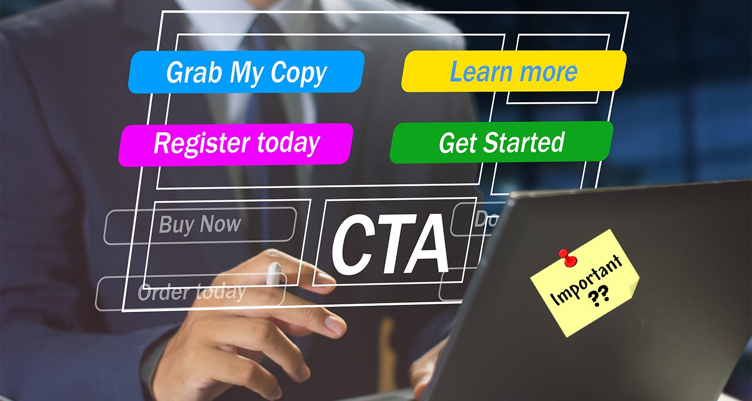
Why is CTA Important?

CTAs can be either direct (purchase now) or soft (find out more), depending on where the buyer is in the purchasing process. The higher they are in the funnel, the softer your call to action should be.
Creating a captivating call to action can be challenging. That is why we use CTA marketing tactics such as A/B testing and conversion rate optimization to test various parts till we reach our conversion rate goals.
What are the Types of CTA?

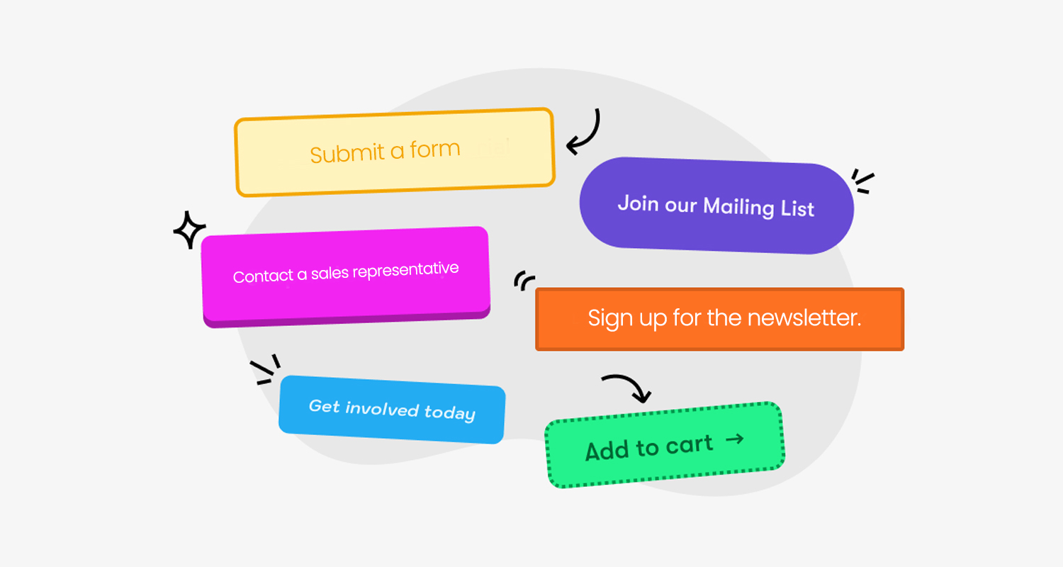
In many circumstances, CTAs are conversion-focused. They encourage customers to buy or join up for a free trial (like in the example above). However, CTAs can also lead users to:
- Sign up for the newsletter.
- Share your content on social media.
- Submit a form.
- Review a buy.
- Contact a sales representative.
You'll need to tailor your language to your CTA's aim. Conversion-focused CTAs might be more straightforward, but when asking people to review a purchase or share your content, you should use softer language.
Your CTA format must also vary depending on the use case. CTAs could be Buttons, banners, links, images, and popups. Buttons are the most popular sort of CTA. We utilize them on this blog alongside banners, popups, and link-based CTAs.
What are the Benefits of Good CTAs?

A CTA in marketing does more than just increase conversions; it also guides your audience, collects data, and promotes engagement. Here is a look at the additional benefits:
- Increase revenue: Visitors will not become customers without a push. Conversion-focused CTAs should boost sales and revenue.
- Collect customer information: Use CTAs to collect information (such as an email address) from consumers who aren't ready to buy yet.
- Direct your audience: CTAs serve as signposts, allowing visitors to easily understand what they need to do next.
- Increase engagement: A top-of-funnel CTA, like as an email sign-up form or a text-based "find out more" link, can entice people to interact with your company further.
However, avoid trying to achieve too much with a single CTA. You will merely confuse the user. The best method to avoid overwhelming your audience with numerous CTAs is to identify the most important action you want your user or audience to take and direct your primary CTA toward that objective, whether it's inputting an email address for lead generation or phoning you for more information. Ask the user to do this only once and attempt to put it as close to a piece as feasible.
What are The Top 5 Call-To-Action Strategies?
There are numerous strategies available for creating a high-converting call-to-action or optimizing the existing CTAs on your site.
1. Strong Action Words
You want your users to take action, correct? So, utilize action verbs. Strong action verbs convey a sense of urgency, energy, and motion. They propel users onwards while eliciting an equally strong response. Here are some popular action verbs to include in your CTAs: Buy, save, subscribe, download, get, claim, reserve, and discover
2. Sell the Trial
Certain calls to action make it impossible not to click on them. One of the options is a free trial. It works especially effectively for SaaS companies, as customers pay a monthly subscription rather than purchasing the goods completely. According to First Page Sage, free trials for organic traffic have an average conversion rate of 8.5%. Free trials are extremely effective because they eliminate numerous barriers to purchasing. Users should not have to wonder what a product will look like or how well it will answer their concerns. They get to experience it for themselves.
3. Benefit-Oriented CTA
You must communicate to users what benefits they will receive. That is why it is great practice to include a reward in your CTA that motivates people to take action. That might be anything like: Reducing expenses, Saving time, Losing weight, Solving a pain point. The example from Evernote is an excellent example of a benefit-oriented CTA. The headline highlights Evernote's fundamental benefits and demonstrates how it may help users accomplish a key aim of its target audience: an organized life.
4. Give Consumers a clear and Instant cause to act.
Demonstrate immediate value---whether it is a free resource, time savings, or a solution to their problem. This will be simple if you are urging clients to make a purchase. However, with an email sign-up CTA, things get a little tricky. What's the solution? Make it obvious what users will receive and make good on that promise when they click.
5. Leverage FOMO
There's a reason why FOMO is such a popular term. People do not want to feel as though they are missing out on something. Take advantage of this by stating clearly what your readers will lose out on if they do not click. Time-sensitive CTAs are an excellent method to integrate FOMO.
Conclusion
A compelling call to action directs consumers to the next step, increasing engagement and conversions. By implementing these strategies and testing your CTAs, you may convert casual visitors into repeat buyers.
To make an impact on your readers, you'll need to improve your copywriting abilities and conduct statistically meaningful A/B testing to optimize the design and placement of your CTA. However, if you use the methods described above, you'll be off to a good start.
Frequently Asked Questions
What makes a CTA effective?
An effective CTA is clear, action-oriented, and compelling. It uses strong verbs, highlights benefits, and creates urgency to encourage immediate user action.
Where should I place my CTA for the best results?
CTAs should be strategically placed where users naturally engage with content---such as above the fold, within blog posts, at the end of articles, or as exit popups.
How many CTAs should I include on a webpage?
Avoid overwhelming visitors with multiple CTAs. Stick to one primary CTA per page, with optional secondary CTAs that guide users toward supporting actions.
Should I use text-based CTAs or buttons?
Buttons generally perform better for conversion-focused CTAs, while text-based CTAs can be useful for soft conversions like newsletter sign-ups or content engagement.
How can I measure the success of my CTA?
Track key metrics like click-through rate (CTR), conversion rate, bounce rate, and engagement analytics to determine how well your CTA is performing and optimize accordingly.
